You found it – that perfect color work pattern. But the colors shown in the sample garment aren’t exactly your favorites, or the intended recipient likes orange but the original doesn’t have any orange in it. What to do?
There’s a lot of debate about color and design, not just in knitting but in all the visual arts, so there are any number of approaches that one can take. (I was recently inspired by Ysolda’s post on using color combinations found in nature!) However, not being a color expert, I have found the following two rules of thumb useful for substituting colors in a pattern: 1. Select yarns with a similar color relationship as in the pattern, and 2. Choose yarns with the same contrast as the original garment.
For example, a sweater I knitted over the winter is a modern Lopapeysa called Asymptote. I like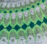 d the colors of the original but wanted more blue.
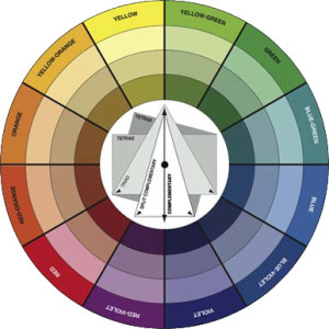
If we look at a color wheel we can see that the original sweater pallet ranges from yellow-green, to green, to blue-green, which are all adjacent colors. If I want my sweater to have a similar feel, I need to make similar choices for a tone-on-tone effect. So, I decided to choose from the blue-green and blue color families, which are also congruent.
Next, and possibly even more important, is contrast (also referred to a color’s “tone” or “value”). The human eye has more rods, or light receptors, than cones, or color receptors. That means that when looking at colors together, we notice the contrast between the colors most. 
So when choosing yarns, it’s the contrast, or black and white information, that will help us see the pattern. But seeing contrast in yarn can be difficult when you are accustomed to looking at the color of the yarn. The solution is to convert the colors to their black and white values, and the simplest way to do that is to take a picture.
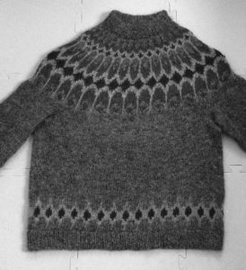
In the sample sweater, you can see that there are several different shades. But it’s even easier to look at a black and white version of the same image. To convert the image, I used a photo editor to transform from color to greyscale. Some programs might have this feature under a “filter” setting, and some smartphones have a built-in black-and-white option.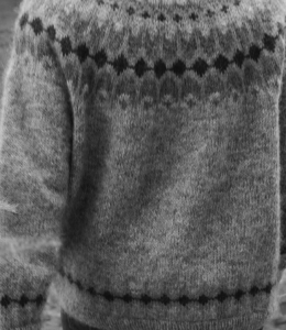
In the black and white version you can focus on the contrast or values of the different colors. We can clearly see that the grey body of the sweater and the lightest green have a similar value, the mossy green is a shade darker, and the bottle green is the darkest shade. So to substitute, we need 4 colors with 3 different values.
To choose yarn, it would be easiest to shop in a store so we can evaluate the colors with our own eyes, in natural light. But Iceland is a bit far for me to travel just to pick out yarn. Instead, I can shop online and “take pictures” using the screen shot function on my computer, then convert the images to greyscale as I did before.
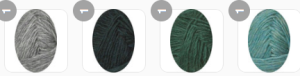
There are several online stores that sell the Icelandic yarn I want, but the one with the clearest images that I found was The Wool Sweaters. First, I put the light grey (#56) called for in the pattern in my basket. Then, I know I have to have a very light shade of blue, so I choose the Glacier Blue – the lightest shade they make. Since I’m sticking with blue and blue/green shades, I can use the original dark shade from the pattern, Bottle Green Heather, because it’s a dark teal and looks good with the Glacier.
Now to choose the medium blue for the “background” section of the yoke. At first, I’m thinking about a dusty blue to substitute for the dusty green of the Celery Green in the original. But they don’t really have a slate blue that compliments the Glacier color – some of the medium blues have a purple tone, and that doesn’t work with my color wheel choices of staying with blue and blue-green. So, sticking with the teal theme, I decided on Lagoon Heather, which is a medium shade similar to the Celery Green.
To see these together and evaluate, I go to my basket and take a screenshot of all the colors together. The hues look pretty good I think – complimentary in the tone-on-tone I was going for.
Next, convert the image to greyscale to evaluate the contrast. Will the pattern show with these choices?
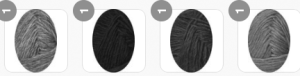
Look at that! The light blue and light grey are about the same shade, with the Lagoon in a medium value and the Bottle Green a distinct darker value. The pattern will show nicely with this combination.
Finally, one last complication: I would prefer a darker shade of grey for the main part of the sweater. But how will that affect the pattern? Will it work?
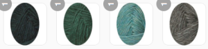
Interesting. There’s a shift here – instead of the lightest shade being equivalent to the sweater body, now the medium shade of blue is equivalent. This means that the bands on the bottom of the sweater body and sleeves will pop out more (higher contrast between Glacier and the medium grey), while the background of the yoke and the main part of the sweater will blend together a bit more. Is that good or bad? It’s really up to the knitter. I’m comfortable having the yoke background and sweater body blend a bit, knowing that the main part of the design – the elongated asymptote pattern – will stand out.
One other note about knitting stranded colorwork: There is a dominance in this type of knitting that can greatly affect the way that different colors interact in a pattern. Others have written on this in more detail. Check out this post at Paper Tiger for a how-to and another great example from Beth BrownReinsel. I appreciate that the designer of the Asymptote sweater, Lars Rains, has taken this into account and designates which colors should be held dominant at each stage of the charts – it really makes a huge difference in the final outcome.
Speaking of which, here’s my finished sweater!
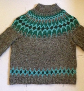
I’d call this a resounding success – the colors are much more to my taste and the pattern still stands out well.